Week 1 - Inspirations and Forced Perspectives
Despite my abscence in the first week of my on-campus lesson, I have been given 2 tasks to do and those involve Forced Perspectives with my own attempts at it, and what game, individual or studio inspired me in taking part in this course and persuing my dreams.
Task 1 - Inspirations
Our general task is to design something for a child's dream and for that, I need to find an artist that inspires me in the project. After taking a look through something that can help, I think I managed to find someone to inspire to.
Inspiration: Quentin Blake
Quentin Blake is an English illustrator and child book writer who's most recognised for the illustrations that he did for Roald Dahl's books as well as other writers and himself. Examples of his involvement with Roald Dahl would be Matilda, The Twits, Fantastic Mr Fox, Charlie and the Chocolate Factory and other stories that he worked for at the time.
I have seen his art in Dahl's books and what inpired me about his work the most was the the colour and the style that he goes for. For colour, he uses waterpaint colours to give the characters a faded tone and the idea that the drawings have come to life by a child who painted them, including some paint spilling out of the outlines. It'd also make sense since waterpaints were commonly used by children, at least from my own experiences.
As for the style, all of the characters and props have been drawn roughly with squiggly lines, gaps inbetween the hair and head, bizzare proportions and other details. This is a unique style that like with the colours, gives the impression that the drawings were done by a child. There is some intended details to the characters: normal or human characters have dots for eyes while goofy or inhuman characters have googly eyes. There are shadows to the backgrounds to give them density and the bigger the props or characters, the more details are added to them.

What I intend to do with this inspiration is to create a dream that has been constructed by a child, and the child-like drawing by Mr Blake has given me a lot of ideas for what I would like to draw: Examples of this would be to make the main child character normal looking while everyone else can either share the same traits or be drawn differently with bigger eyes, strange proportions and funny poses.


Task 2 - Forced Perspective
For this task, I was told to take pictures of whatever I had at home (e.g: toys and figures) in order to create a Forced Perspective with them. The whole point of forced perspective is to create an image that makes the object look bigger or smaller using angles and positions. For this task, I have made about 4 pictures and I'm going to show you what I've done to create the perspectives.
Part 1: The turtle

This was the only surviving image taken from the hill in Britwell where I took multiple captures from Borderlands figures, Cybermen toys and this turtle figure. This one was taken on a wooden staircase from a bottom angle to give the impression that the turtle is on higher ground. I hid it right so that it doesn't reveal the stand and only shows the head and flippers.
The reason why only this image worked was because the rest of the images were more like poses than feeling like they're part of a world. I wasn't able to do much of the Borderlands figure since she was on a stand and unable to function without it, the Cybermat was already lifesized so I couldn't make it look any larger, the cybermen figures looked as if they were on a platform separated from the environment and there were other turtle pictures that made it look a lot smaller than the image above.
Part 2: Cybrogs on a bridge


After a refreshed mind, I have found a good spot for my next pictured for the task. This is a wooden bridge in Burnham Beeches and I decided to capture shots of the Cybermen figures sitting down on the bridge or peeking over. I had to be really careful as to avoid capturing the metal sheet, or at least blur it out of the shot.
For the top image, I tested it on the Invasion Cyberman. I positioned the camera to focus on the front part of the bridge and the Cyberman, blurred the trees and sky and captured it. The next image is of a Tomb Cyberman and miniture Cybermats. I got really lucky with the sun and managed to use it to my advantage. I had it shine behind the last 2 Cybermen to give off natural light to them. The final image has the Cybus Cyberleader lean over the bridge with 4 different Cybermats next to it. The Cyberleader was the trickiest to make sit down since these figures were made impossible to do so. I did the same trick like with the Tomb Cyberman but this one had a better lens flare in my opinion.


On the right of this paragraph is what the bridge looks like on the outside and in what position the figures look like while I took pictures of them.
Oh, and there's a bike lock and a glove. Ignore that.

Week 2 - Start of the Story
This week has been a big one as I've had a lot to do to prepare for a larger project. This big project is creating a child's dream. For that to happen, I would need to create a Script, the characters and the environment.
Part 1: The Script
Before we begin to draw the characters, they need the script. And for this, I have written down a 5 page script that details the events that occur in the child's dream.
The summary is that a crystal transports the child to a desert and there's a war between the Lions and the Wildebeests. The Child chooses to work for both of them so he can conclude who to side with. Spoilers, but the child chooses no one and both parties die at the end.
Feel free to read the full script down below.
Part 2: The Characters and the world
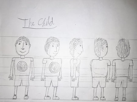
As I've been writing this script, I have also been drawing the appearance of the characters. Specifically, the Child, Lion and Wildebeest. They have a front, side and diagonal angle and would carry props that I have also drawn. Following Quentin Blake's style, I chose the child to have spots for eyes and come off more innocent and small. The animals on the other hand are more bulky, disproportionate and have the angry googly eyes to let the viewers know that they're a completely different character; Perhaps an antagonist.
There have been a bit of mistakes and change of mind in making a back view of a character since I find a back diagonal a lot better to me and the lack of room for a back view.


My next challenge was to visualize the world and locations that happened in the script. They are rough sketches at the moment and I will go back on everything and improve on it all with better experience.
This is the outer part of the map that shows how distant the 3 locations are. The following locations presented are the Yellow Pond, the Brown Grass and the middle part of the map where the story begins and ends.

Under this paragrapth is the visuals for the Brown Grass and the Yellow Pond which shows the soldiers staying guard, resting or doing all of the above in their hideouts. I didn't focus much on visualizing the middle since it's a flat area with nothing to draw on.
Additionally, I've drawn concepts for the bedroom that appears in the beginning. It's a short that doesn't need much attention, but it's important that I visualize that part.


Week 3 - Point Perspectives
For this week, I've delved into the art of point perspective. This helpful tool has helped me out with drawing objects from another point of view or from certain points of distance, as well as give the illusion that what I'm looking at is 3 dimentional despite being a flat image.. I'll be going through the 3 different types of point perspectives and use my own work as an example.

One Point Perspective (OPP) is a perspective is the most basic perspective and as the title suggests, it only uses one point. This method is mostly for making something look bigger or smaller depending on how close or far it is from the original point, but it can also make 3D shapes when used right.
An example of a OPP is the 3D letters that I've made in 2D made into 3D using a single point of perspective. I placed a point above the text and then started drawing lines that connect to the corners of the text. I then draw new lines with OPP's help and create a 3D illusion.
Note: For the following 2 PPs, I used a drawing mannequin's head as a reference on where the characters face within the cuboids. I then draw over the head until it gets unnoticed.

Two Point Perspective (TPP) is similar, but has more uses now that it consists of 2 points on opposite side. You can now use the lines to make a cuboid shape and create 3D rooms with 2 walls and a corner in the middle. you can also draw objects inside the cuboid to make a diagonally faced object.
For the current practice, I was tasked to draw a head using TPP and so I started with drawing a cuboid with the 2 points. I then sketch the cuboid and draw my head on the inside with the help of the pre-mentioned mannequin. I then add the features over the mannequin head sketch and called it there.


Three Point Perspective (ThPP) is the most advance of all point perspectives and the reason for that is because it allows people to draw objects at more complex angles compared to TPP. There's more lines being drawn on more sides and this helps out in improving the positioning of certain objects.
For my final demonstration, I've attempted to draw the same head on the other side and using the same techniques, but with another point. I even used the lines to properly position the nose and eyes so they look the right way.
Week 4 - Improvements
After learing so much from the last week, I have been given the opportunity to redo my old characters and environments using Point Perspective and new tools called Line-ups and Turn-arounds.
But before I could show off the improved designs, I have to show a skull I've drawn. The point of this is to understand the importance of proportions and how to draw a skull that represents that.

Part 1: The new environment
With the use of Point perspective, I managed to reimagine my new environments and they're a step-up to what I had last time. I've used the perspective on the sign to help create a proper 3D view and help with positioning the other props like pots, trees and ponds.


Part 2: New characters and new angles
With this newly learned tool, making multiple angles for characters has never been so easy. So for this part, I went back on my old characters and done 5 different sides for the 3 of them.
Because my tasks require me to draw everything from each angle (I wish it didn't) this one requires me to draw a human head in all possible angles. As before, I used my mannequin's head as a reference, and then I draw over the mannequin's head so it matches the pose. Of course, I chose to draw the child's head since I want to practice this with the charactcter I made.
For execution, I'd say the top, bottom and sideways were alright, but the diagonals were not my best. This couldn't be more clear as my attempts either just made the heads look like the sideway ones but 45 degrees turned and how one of the heads looked small instead of looking downwards. And if you looked closely to one of the heads, I kept switching the ear's position to the point where my rubber made a smudge. At this point, I've given up on the last head on the bottom corner and don't wish to do this again.


Additionally, I've made a silhouette and size difference between the 3 characters to show how different they are.compared to eachother. The child is clearly the smallest, the Lion soldier has a large mane and robe and the Wildebeest soldier is the tallest with 3 fingers and a tall, thin head.


During these improvements, I decided to dabble into the concept of gestalt. These kinds of tricks involve using black and white shapes to give off the illusion of one or 2 things in a few shapes. Examples being a few circles with white stripes making an outline of a cube or a few splats of black form a WWF panda.
Below, I've made 2 tries for the heads of a lion and wildebeest, but also looking similar to other props.

This drawing is the face of a lion, but the shapes give off the appearance of a vase. With the 2 eyes on the side looking like gaps within the 2 handles and the round top for where content is poured inside.

This one is meant to resemble the head of a wildebeest, but on other inspections, the head creats a shape of an hourglass with decoration on the sides.
Week 5 - Vehicle, Enviroment and Asset. Oh, and some space stuff.
For this week, I've delved further into creating depth and space and was told to create a Vehicle, Environment and Asset that's relevant to the child's dream project I'm making or other stuff that I can think off.
Note: I may not use this technique to an extent due to my inspiration being a complete opposite to these tools. (I don't remember the last time Blake had to draw a hundred perspective lines on the Twits.) Anything in this week is just reference to what I learned.
Vehicle
There are no vehicles in my child's dream so I chose a random vehicle to use. I went with a rusty minecart. Our teacher did show me a method where you first draw the side of the cart with squares, replicate that on one side of the lines and draw the front whilst using the squares as reference. This one has helped me quite a lot with drawing the cart.
Environment
This is the part where I've been struggling with these tools when it comes to environment. For this, I mainly focused on the things found within the child's dream but trying to also replicate the same sign on the other side. I didn't have the space to do the tree, but I'm thankful I didn't have to do it.
As seen, it's obvious that the sign isn't the same length. I did my best to mark the height of the sign in a different direction and drawn the same lines. My problem however was with the width as it was a complete guess to where I meant to place my lines.
Asset
This one was also a pain to get right. My idea was to draw a sharpened stick that could possibly have a use in the child's dream. For this one, I used the lines to make a cuboid and within the cuboid, I made a cylinder with a pyramid on the end. I used an X to help centre another line which helped draw a pyramid on the end.
The final result doesn't look that great with the pyramid sticking out of the box, but at the end of the day, I made a sharp stick and that's what matters to me.


With those 3 objectives done, I've moved on to the most and least fun task for this week. This one involved creating spaceships or other contraptions out of real life props that I find in my home. Sort of give them a new breath of life or purpose. As much as I like to get creative with ideas, these creative choices end up biting me in my behind and I end up feeling bad for going too far. What do I mean by this? I'll get right to it.
Object 1: Pen Mug
Long story short for this particular prop: I had an old Dr Who Cyberman mug that I got from a garden center. Over the years, it broke again and again thanks to general carelessness and clumsy Mums. Now, this thing is my pen pot and it'll stay like that until something unmendable happens to it.
So my idea was to create a space station out of a Cyberman's head (Ironic if you've seen Wheel in Space) and the pens and pencils would act as the buildings surrounded by a huge dome protecting it. The eyes would allow entrance to small aircraft and the mouth would dispose of rubbish. There would also be glass exteriors with beaming light where people normally live there. And because this is my brokem mug, I had the idea of drawing a broken side with loose shards around the broken part. I didn't draw more broken bits due to scaling issues, so let's pretend that the other pieces scatterd outside of the picture.


Once I've done the outline of the picture, I've had the idea of using watercolours for this drawing. Why? Because my inspiration Quentin Blake did the same thing and so I've decided to use the foundation of these drawings as practice with watercolours. This is where the biting part comes into play.
I was very careless with the watercolours and because of it, I've had one too many situations where I had black paint smudged on the picture. Either by accidental strokes with the paintbrush or paint getting onto my hand and either removing the colours or spreading them someplace else.
Another thing that Didn't help was how dark I went with the colours and how it contrasted too heavily with the bright lighting. Most of the time, I couldn't tell the difference between the sky and blue parts of the station unless I had to shine really bright lights to tell the difference. I had pencils to outline it, but they're mostly covered. Now I've drawn around some parts with a black pen, but it was a chore drawing around the smaller parts of the picture.

After all that, this is the picture that I ended up getting.

Object 2: Water bottle
From one drinking container to the next, I chose my orange water bottle as the next thing to bring life to. THis time, I had the idea to take inspiration from the Advisor Pods from Half Life 2: Episode 1 and 2. Simply put, they were white escape pods for floating slugs. I wanted to create something also similar but exposing more of the shell and revealing the inside.
For the back, it would be a regular thruster with 2 robotic arms on both sides of the ship. The sides would have a metal frame to keep the shell intact and not fall off and the front would be like a regular bottle cap but with a bunker-like door with a valve to open it.


Object 3: Bottles of Gin flavouring

Inside would be a feuts-like creature that has 1 hand, 2 legs and a tail. It would also have a tongue and 2 small eyes that look sunken-in. Round him are bubbles, mainly coming from the engine that's boiling the water from one side. The creature would be plugged into each of the corners to maneuver the ship.
For this one, I made the better choice of avoiding watercolours so I don't have to worry about complications or my lack of skill ruining the picture. I'll only consider the idea of watercolours once I get better at it.
For now, I have this drawn in pencil.
Week 6 - Colours
For this third and final prop drawing, I've increased the bottle count from 1 to 6 with whatever's left of my Gin flavourings. Their respected flavours are shown right here on the images. Even if I had all 10 flavours, having to do all of them would be a complete mess, so thank god I only drank the 4.
My idea was to make another bottle spaceship, but this time the 6 bottles would act more as fuel than shelter for one alien. each flavour would be in their own bottle and both connected to a fork-like pipeline with thrusters on the middle. On the top would be a pilot deck for controlling the spaceship with 3 windows to view the front.
I would say that this one was the least practical with a lot of flaws that would make the Star Wars: TLJ Bombers look more believable. But with that being said, The image is complete. Like the last one, this is done in all pencils.
With what I learned from the lessons, I was tasked with creating an infographic that goes through all the important parts of colour. This is to be used as a display of my knowledge and for reminders of what's important when picking my colours.

As part of another criteria, I went through the effort of recreating the Colour wheel roughly with anything coloured blue, yellow, green, red, orange or purple. Anything like money, Lego, toys, food and pencils.
Note: Apologies for the lighting, but I do promise you that these crystals are red.

Week 7 - Oil Pastels
For this week, I continued with the idea of harmonizing and contrasting colours through the use of Oil pastels and redrawing the characters yet again in these methods.
But before I did anything like this, I had to draw a quick sketch of my face. I place a mirror on the table and copied my likeness without taking my eyes off the face and not letting go of my pencil. This was to give me line confidence in how I draw with my hand. I've drawn my face twice with different coloured pencils and the result was something resembling Charlie from Hotline Miami.
With that quick task out of the way, I began experimenting with my oil pastels and started with the Lion Soldier. This method involved me using a sheet of paper that had multiple colours drawn on it and formed together into harmonizing colours. Over it, I drawn the Lion Soldier and pressed hard at the oil pastels. When I was done, I turned the page and had the Lion Soldier traced with the colours. The image is a bit inverted.


Same energy


With the pieces cut out, I glued them in the right order so some parts are obstructed while the others sick out on the front.
With the desired position, I now needed to make an outline around the shapes and and add other details to some of them. For instance, I would have to draw the nostril and the pupil.
Below is my final result.


Week 8 - Shots and Tones
For this week, I was given a task to take multiple shots of a person or figurine in different distances and record videos that go through the basic camera movements like zooming and panning. I decided to use the Tina figurine from Borderlands 3; this was also the prop I used for week 1 before deciding to shift to the Cybermen. All of the videos and photos have been labeled in name in this list.
Note: Sorry for the noise or shaky camera in the videos. It was cold and windy when I was recording.


Next, I've been given a list to do tonal drawings using B pencils. In short, these B pencils are normally used for shading and how I normally use them is by smudging them to creat a shade. Though, how I did it was pretty messy so there are normally gonna be some stains on the paper.


I started things off with my right hand slammed on a page and drawn around it. The wrinkles, knuckles and nails were all done by hand (Insert laugh here). Not only that, I focused also on the darker parts of the nails and the red skin from the cold to give the hand some level of depth, as well as a shadow.
The next thing I had to draw was an object and I chose a Pritt glue stick. Since I had other complex things to draw, this was a pretty basic object, but it luckily had a reflective label that gave me the idea of making a white strip on the right side to give off a little light. I additionally added shadows underneath the bumps on the lid.


I do believe that of all the environments I had to pick, this one might've been a bit of a clumsy attempt of guessing where the trees are, how many hills are there and whether or not I should include the sheep in the photo or not. In the end, I chose to ignore the sheep since I wanted to focus more on the hills than anything else. I think I regret that choice now.
For this self-portrait, I was a tad bit afraid to take my own picture, so I took a lady in a greenscreen from another module called Digital Toolbox. I was gonna use tracing to help with finishing outlines quicker, but the printer broke so this was all done from memory. I would say that around the shirt, armpits and under the eybrows, I've done a lot better with the shading on this one. If I taced this one, it could've been better.
Week 9 - Drawing backwards
For the 3 pictures I'll be showing, I've been tasked with drawing on black or mid-tone paper with white and maybe black pencils. However, I wasn't able to find any mid-tone paper and all my white pencils are broken so I've decided to use the black cover of my art books and draw on them with my white oil pastel from my last weeks.
The following pictures I made are in relation to the main project involving the child's
dream.

This one is of the sign in the middle of the desert and going into this picture, I did not have that much to work with the oil pastels when it came to oulines. They were pretty big lines so I did my best to make this as close-up as possible so I don't need to worry about the smallest details. I attempted to create shadows on one side of the sign by lightly stroking the white pastel and drawn a rough background.

This one is of a newly grown tree growing inside a dead one. The leaves in this one are a prime example of my issues with using an oil pastel when it comes to smaller objects. Other than that, there's the lines on the dead trunk and branch, as well as a shadow.
Now for the gambling bowl and carpet, I think this one has been put in the most detail, and that involves the shadows on the bowl. After looking up a few images, I got the full picture and replicated the shaded parts. After that, I placed a small shadow, did the following with the game dice and used the sides to make a rough material on the carpet.


After going out, I managed to get myself some brown paper from Range. With that, I got to work with not only white oil pastels, but also black. I decided that for this one, I'd draw the Child's bedroom with the box, crystal, and a window with curtains shining a ray of light on the props. The black is used to draw the outlines of a prop, colour in the whole thing black or for shadows, while the white oil pastel is used for whatever's coloured white or the bright parts of the room.
The Design Brief
For this section, I went to work on a Design Brief that includes most of the work I've done involving a certain topic. The one I chose was my own project and you can see it for yourself on the Document by clicking on the blue button.

Click to open Document