Week 1 - Spacehenge and Hybrids
At my first week in University, I've been tasked with testing out Adobe Photoshop and was given 2 tasks. One involved creating a new background for a Stonehenge image and the other is all about creating hybrids with the combination of 2 animals; I decided to take my own spin on the latter task.
Task 1 - Spacehenge
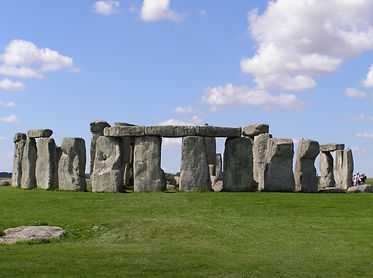
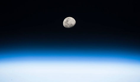
For this task, I've taken an image of Stonehenge and a background image of the moon in space (Link to both images below) and attempted to replace the Stonehenge's background with the replacement. I've achieved this by using a tool called Color Range which I'll explain how I've used in detail.
Once I've gotten the image on Photoshop, I've selected the color range tool by selecting the following: [Select > Color Range]
.png)
It opens with a window displaying the project in black and white. The whole point of this tool is to select a specifically selected colour on the map and display it in white while the unselected parts are black. There are 3 eyedropper tools that selects the colours the user wants to highlight: The regular one only selects one colour and any new colour selected with scrap the previous one. The second option allows to stack selected colours while the third unselects the selected ones. The Fuzziness slider allows any pixels of slightly similar colour to also be selected; the higher the Fuzziness slider goes, the more pixels are selected.
My goal was to select all the blue on the image so I can clear the sky from it. I then set the Fuzziness to a tolerable level so I don't accidently take a small tinge of blue from the rocks or the grass. When I press Ok, my project should've looked like the image below.
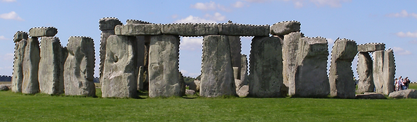
Although, there are some imperfections with the clouds, people, rocks and even the birds on the image. With the help of the Quick Selection Tool, I selected the clouds, any smaller corners that weren't in the image and unselected the rocks or other parts that were affected by the Color Range Tool. After that, I've selected the following: [Select > Inverse] This command allowed me to inverse the selection so that it covers the stones and grass rather than the sky.
.png)
.png)
Why did I do this? This is because I wanted to copy + paste the image into it's own layer and I didn't need the sky. Why I even wanted to select the sky in the first place was because it saved time to select the one colour and then invert the selection so I can cut the stonehenge from the layer, paste it onto a new layer and then delete or hide the original image, leaving a transparent background. Finally, I dragged the new background image onto the project as a layer, placed it behind the Stonehenge layer and resized it so it fits.
This is the final result.
Sources
Click on the images to open a link to the source
Task 2 - The Hybrids
Previously, I was told that I wanted to take my own spin on the Hybrid task, and my idea was that instead of combining 2 animals, I combined an animal and an object. I had to make 2 images and I'll be going through each of them in detail.
Task 2.1 - Bananatiel
This first mistake of nature is a combination of a cockatiel and a banana. This idea came from plenty of bird videos involving cockatiels and a banana so this was my inspiration. I thought that having one banana wasn't enough and decided to take a bunch and put a bird head on each banana.
For the banana, I've taken a stock image but it had problems with the shadow: My idea was to turn it upside down and place the cockatiel heads on the tips of the bananas. However, there was a shadow that made the image look odd upside down so my solution was to remove the shadow by using the lasso tool to select the shadows and then delete them from the layer.
For the heads, I took a stock photo of a cockatiel and smoothed out their head to get rid of the feathers. Next, I turned their head so it's positioned properly on the bananas and then used both the smudge and blur tool to blur their necks into the bananas. For extra detail, I put the black tip of the bananas on each head with each head having a different tip.
Finally, I've placed the pair of legs from the cockatiel image on the bottom part of the banana and smoothed out the top parts of the leg to blend with the banana, just like the bird necks.

Task 2.2 - snAke-V

My next hybrid is the combination of 3 green snakes and an AV cable. There has been a lot of jokes and tropes of people confusing cables and ropes with snakes so I decided to go with the most coloured cable I know, the AV cable and stick 3 snake heads on the yellow, red and white ends.
I first started with the tail when I had the idea of covering the other end of the cables. I lowered the saturation to a 0 and made it dark enough and still see the snake patterns. The shadow on the tail was self-made by drawing a grey line outside of the tail and blur out the side. I applied the same thing with the snake heads so they also blend with the cable's shadows.
As for the snake heads, I decided to stick to one species of snake, specifically the green ones for the sake of consistency. To change their colours, I have only the skins of the snakes selected whilst ignoring the eyes and tongue, selecting the Hue/Saturation tool and changing the Hue of the skin and apply highlights. Yellow was the easiest as I only changed a small part of Hue, White needed it's Saturation lowered to 0 and brightened slightly and Red was the trickiest since it was a tough contrast to green and results ended with either orange or yellow. However, it did take a while until I found the right level for the red snake. After I coloured them, I use a similar smudge+blur tool for the cockatiel hybrid to smooth the head into the cable.
Sources
Click on the images to open a link to the source
Bananatiel


snAke-V


Week 2 - Greenscreens and Buildings
For this week, I have been given 2 more tasks. The fist involved having me replace a greenscreen background with a sky and the other involves me giving a building a makeover to look like it's been abandonned.
Task 1 - Greenscreen Lady
For this task, I have been given an image of a lady standing behind a greenscreen and had to replace the greenscreen with a sky. Additionally, I would need to make some fixes to the lady in order to improve the image.
I started by using the Color Range Tool like last time with the stonehenge. I select the green parts of the background and adjust the fuzziness to an acceptable level so I don't accidently select the lady's face. Any other selections are done manually to remove the selected strains of hair that don't connect to the lady.
After my selection was complete, I click on the Add Vector Mask button below the layer page. The purpose of this mechanic is to cut out the unselected part from the image without doing it permanently. It uses Black and White values like the Color Range Tool and makes the black parts transparent. If I were to ever want to change the transparency, I click on the mask and paint it black or white.
.png)
.png)
.png)

Next, I notice a big problem with the lady's image and that is any green parts left. This does commonly occur whenever there's a green reflection off of people's bodies, props or other objects whenever standing in a greenscreen. The best solution to fixing it was to create a colour changing layer by clicking the Hue/Saturation icon in the adjustments tab. By Ctrl + Clicking the lady's Vector Mask layer and then clicking the Hue/Saturation icon, I can now change the colour, saturation and brightness of the lady.
To make sure I only change the green part, I click on the dropbox that says "Master" and select "Greens"; This allows me to edit the green separately. Then, I turn down the saturation all the way yo 0 so that any green on the lady is gone.
Below is the before/after results.
.png)
.png)
.png)
.png)
After I've fixed anything green with the lady, she's ready for her new background. I have been given a background, but I chose to instead find a more liveley one.
After that, I went back to edit the Hue/Saturation layer and changed the dropbox back into "Master". The following changes apply to all of the layers that are underneath the H/S layer. I increased the saturation slightly so that the skin of the lady comes off more natural, rather than from artificial flouresent light.
.png)
.png)
.png)
Finally, I wanted to soften the side of the lady so any sharp cuts go unoticed. I used the Ctrl + Click trick on the Mask layer and inverted the selection so it touches the sides of the lady. I then use the Feather Selection Tool to soften the sides to a certain degree.

This is the final result.
Sources
Click on the images to open a link to the source

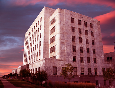
Task 2 - Ruined building
For this task, I was given an image of a building and my task was to edit this image heavily. I had to replace the background, make the building look ageing with masked textures, add decal using the paint brush tool, drag and drop images that help in the scenery and create a lens flare on the side.

I began by doing the same strategy of using a Vector Mask from the last task to cut out the background and placing a new background. For this, I chose a cloudy dawn sky. You may have noticed that the left side has its tree and building removed, and that's due to an issue with trying to clear out the sky on the leaves and the building looking weird with the tree gone. I decided to wipe both parts on the left side to avoid potential issues.
After that, I added a colour balance layer with a Vector Mask in order to make the building reflect with the warm coloured sky. If I was to ever want to add more objects, they need to be above the layer as to avoid clashing with the colour change.
.png)

.png)
My next step is to make the whole building look like it's been untouched for years and is slowly being eaten away by nature. My solution was to place a grime texture above the building, place a building shaped Vector Mask on the texture and then change the layer dropbox from "Normal" to "Soft Light" This dropbox changes the image, making it blurry, grey, colourful or reversed. I chose Soft Light due to the gentle way it's placed on the building, removing the white from the layer and making the black stick to the building naturally.
After that, I decided to paint the Vector Mask in order to get the trees, bushes and other irrelevant objects out of the VM. This is so that the grime texture is focused on the building and only the building alone.
.png)
.png)
.png)
For this stage, I wanted to make another shade to the world and that was a slight tint of blue. On a new layer, I've made one flat colour of light blue and set it to overlay. This made the layer transparent and helped to make the scenery more colder. I then decided to make the building more burnt on one side so I pulled the burn tool and started painting soot on the right side. I focused mostly on the windows to leak out black substances and then partially paint around the windows. I was going to do the other side, but it looked off due to the lighting so I skipped it.
.png)

Now I was ready to place other assets and edit them into the scenery. I began with a decal that had dripping green dirt and placed it on the top walls. With the transform tool and holding down Ctrl, I managed to position them so that it looks like it's naturally blended into the wal. The top parts are a bit inaccurate, but that's resolved in my next step with the paint brush tool.
.png)
With the given paint brushes by our teacher, I had access to paint vines, leaves and other patterns in order to create vegetation in the scenery. And so, I took the vine tool and drawn 1 or 2 vines in my prefered corner and drawn down. For each, I change the colour and size to represent position and distance, and then I use Blending Options to give the vines a shadow. After the vines, I do small bushes around the top parts of the building and do the same smaller/lighter trick as I did with the vines.
.png)
.png)
Somewhere down the line, I have had a change of mind and wanted the plants to be dead. So I pulled a selection tool and made a square around the 2 layers. I then went into Hue/Saturation not via a new layer, but a new window. This is due to the new layer changing everything if placed with the vines and the selection was needed so I don't accidently make the whole sky green and yellow.
.png)
In order to replace the bush that I just deleted, I decided to rip a tree asset and bring it in closer than before. I would create an illusion that it's so close to the perspective, that the tree becomes blurry. Using the lens tool, I measured it to a suitable blur and then recloloured it with the same Hue/Saturation tool from before.
As seen in the images, I had the idea of adding the Combine Dropships from the Half Life series. I was always interested in these designs so I put them in as background decor. I made them blurry and changed the colour so they can blend into the sky but still be visible. The positions and colours did change overtime when I had lighting issues with the lens flare.
.png)
.png)
For the final touches, I added a lens flare from an automatic lens flare creator in Photoshop. I positioned it so that it's like a sundown. After that, I changed the layer from Normal to Screen which removes all the black from the lens flare layer and makes it transparent.
.png)
And for the final final touches, I've added a flock of seagulls to the left side where the lens flare is present and made them slightly blurry to give off artificial distance. Originally, I had the Dropships on that side, but they didn't fit with the lighting so they filled in the other side.

This is the final result.
Sources
Click on the images to open a link to the source


Week 3 - Maya beginnings
For this week, I have begun using Autodesk Maya for a few projects. I have had experience with this software in Level 2 and Level 3 Year 2 in college, so I may be ahead in some aspects. For now, I'm focusing on the basics, then slowly make more complex models and animations.
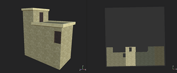
Task 1 - Greek Structure
For the fist task, I was told to make a structure or temple in Maya and I went with a couple steps, a coffin-like slab and a roof that's held up by pillars.
.png)
The original intention for creating these stairs was to duplicate them, shorten the sides and repeat the cycle until reaching the desired height; I decided to take things to another level and begin with the Extrude tool. This tool allows me to pull out new polygons from a face and extend the shape. What I've done was select the top face, extrude it, minimized the sides to the desired results, extruded again and then raised the new face upwards. I repeated this step until I had my desired number of stairs.
For the pillars, I decided to take a cylinder primitive and changed it so that it has more faces on both ends. Next, I select each piece while leaving gaps between the selected shapes. Then, I extrude the shapes and shrink them into the center of the cylinder slightly to create downward lines. This design is similar to the Greek pillars and that's what I was trying to go for.

.png)
I put 2 cuboid blocks on both ends of the pillar, duplicated the pillar and placed both of them on top of the stairs. After that, I made myself a small stone structure in the middle that looks similar to a coffin and placed it on the middle of the stairs between the pillars. I used Extrude yet again, but for 2 instances, I pulled the shapes up without having to extrude twice for a flat surface. This was to make the prop look more curvy than blocky.
.png)
Finally, I made another cube above the 2 pillars and have done the same thing similar to the coffin-like structure. The only differece was that I was making the roof for the structure. I made a sandwich-like bottom and the top was raised and squashed to look like a Trapezium roof.

This is what I managed to make in Maya.
Task 2 - Rendered Spaceships
.png)
.png)
.png)
This time, I was tasked with creating a spaceship and render it in an environment and textures.
I began with a 3X3X3 cube that I've created using a primitive cube and subdivisions to apply more polygons for customizing. I turned on a Symmetry tool that allows me to select things from one side and do the same on the other end, I seleceted it to "World X" and overtime, it allowed me to perfectly replicate everything on both sides while I only did one side.
With everything set up, I started with the body by extruding new wings on one side. I pulled the 3 faces, rotated them, pushed them back and squished them slightly. The other side mirrors my actions as intended.
The back involved 2 of the squares pushed forward and the middle square slightly squished. I then extruded the 3 squares so I could then make holes inside; these will act as the thrusters. To make sure that the curve around the sides look good, I used Bevel to smooth out the sides.
The front was done by extruding the front side twice whilst squishing it at certain levels to form a triangle. The first extrude didn't go too deep and only made a trapezium-like shape whilst the second extrude has went all out and made a triangle. I then shrunk the tip further to curve the top and bottom faces.
For the final touches, I pushed the top and bottom so that I could add curves to both sides. For the top, I've pushed the 3 middle lines and then the very middle slightly above for a better curve. I then tilted the middle to make the front more steep. Lastly, the bottom only had the middle 3 lines pulled down to make a flat surface.
.png)
With the spaceship completed, I decided to smooth it out by clicking on the smooth tool button, which by default is 3. This curves out all the edges and makes the model more smooth than blocky. By default, this is what most of my models will end up looking if the intention is to make a smooth object.
Next, I downloaded some texture packs and created a background for the scene. This is done using a SkyDome which has a huge inside-out sphere surrounding the object and when placing the right image, can create a background like the one seen in the screenshots.
After setting up the SkyDome, I began applying a Chrome texture to the spaceships and a blue reflective surface to the plane underneath the spaceship. I've done this by using a texture called StandardSurface that has options to give the texture a metallic touch. Using a preset called Chrome, I made the spaceships very reflecive, to the point where you can view the SkyDome through the spaceship.
.png)
_edited.jpg)

When looking at it, the models are black and not reflective. But when it's rendered or using a material viewer, you can see the chrome reflection on the material. The 3 images around this paragrapth demonstrate this. I then applies a similar texture to the ground but made it more blue to contrast the ship.
Whilst having this spaceship model, I've decided to make an entirely new render that also includes the temple. This is to be a bit of a mashup of the week.


Week 4 - Cups and Kettles
To continue my practice in Autodesk Maya, I've been tasked with making a cup, kettle and wine glasses. And we'll get right to how I did it.
.png)
.png)
I began with making a cup out of a cylinder with a few extrudes to make an inside, and then make an edge loop tool to make cuts where I'll be placing the handle once I get around to it. Next, I get a donut prefab and reduce the subdivisions slightly in order to match the amount of polygons around the cup. Once I had the right subdivision, I cut the donut in half and used a Target Weld tool to connect the polygons together.until the hole has been completely covered and there's no polygons left.
.png)
.png)

After using the smooth tool, I chose to apply some materials to 3 of the cups and render them for your viewing.
For this one, I had the freedom to mess around with a curve tool and make wine glasses out of them. How I did it was create a half of a wine glass using the curve tool and then use what's called a Revolve tool. The revolve tool would take flat edges like the one I created and then rotate it 360 degrees into a 3D shape. This works properly if the pivot is on the right position. So with the Revolve shape created, I duplicate the wine glass and move it away. With the curve tool and the model you create, you can edit the shape and size by moving the curve indexes.
Below, I have created 3 of them and attempted to give them a stained glass appearance. I had no luck in making the whole thing coloured and it took up too much rendering time, so here's the final results.

.png)
.png)
With the cups and glasses done, my final criteria is to make a kettle. Like the wine glasses, I made a curve of a half dome and applied a Revolve tool to make the base shape of a kettle. With that, I duplicated the shape and used that to edit it since I don't need the curve anymore.
Next, I used the circular tool to make a circle out of a couple polygons on my desired spot. I cut out those polygons from the shape and left a large hole and a lot of extrusions ensue.
.png)
I extruded the edges around the hole and made a short tube. I continuted extruding to give the tube more depth and fill in in the inside. After that, I used the bevel tool on the tip of the tube and the area that connects between the it and the kettle.
.png)
.png)
For the second use of curves, I made a large handle shape on the back and instead of using the Revolve tool, I use extrude face on another patch of circulated polygons. Once again, I use the bevel tool to smooth out the edge of the handle and kettle.
Once I got myself a handle, I decided to cut out the lid and separate it from the model. I used a Separate tool and extruded it to thicken the lid. Once that was sorted, I zoomed into the middle of the lid and made continuous extrudes to make a round round tip for the lid.

.png)
Once the model is completed, I applied the Substance materials to it, with the main body being a shiny but cloudy chrome and the other parts being a black matte plastic.
Once placed in a renderer with cups and mats, the results can be seen below.

There hasn't been much to do with this week, except testing with new materials, tools and the cloth tool that has given me some intersting renders and results. I've given them a try on my pre-existing models and this is just a short brief gallery of random tools I've been playing with.


Week 8 - Fake News and Shoe Phones
With all my photoshop and Maya skills combined, I'm now given the task of completing 2 assessments that each focuses on their respected software. For Adobe Photoshop, I would need to take a photo and edit it into an image for a fake news report. As for Maya, I'm tasked to create a James Bond gadget out of an everyday item.
Assignment 1 part 1 - Fake News
For this Assignment, I had to pick out whatever image I want and combine it with other images to create a fake news scenario. I had the freedom to choose whatever I want, but had to be reviewed by the teacher to avoid having similar work to other people.
The idea I settled with would be me sitting on a bench while a group of cyborgs patrol the park. The point of the image is to show that there's been an increase in augmented humans and that some people (like the one in the photo) don't find the idea any good.
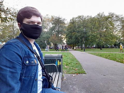
The image that I chose to edit on was the one that I took in Ealing Broadway park. This photo has been taken by a friend with multiple close-ups and having the least people in the background until I settled with the one above.

As for what cyborgs I chose to settle with, I went with the Mondasian Cybermen from Doctor Who's 10th Season.
The image on the left is of a handmade figurine that's been captured on all possible angles, giving me enough material to make the cyborgs walk in all directions. Due to the figure's lesser quality, these are regulated to background characters.
The Cyberman on the right is of a higher quality photo of the real Cyberman. Unfortunately, there aren't different angles for it so it's stuck to looking straight. For that, I decided for it to be the closest Cyborg in the photo in the middle of the path.
To visit the sources of the images, click on them.

_edited.jpg)
I started by cutting around the figurine Cybermen with a magnetic lasso tool so I can take it off the white background and stand. This one was the trickiest since the colour range tool didn't help me out as the white on the figure caught in the tool. And the tool struggled to take out the stand on its own. In total,
I had to carefully cut out 4 figurines out with the lasso tool, and then drag them into the scene. I then applied some editing to each figurine to make it fit in the scene:
-Resize the figurines to fit a similar but higher height than the people in the photo.
- Set Lens Blur and Motion Blur to 3.
-Increase Contrast to +65.
It's easy to tell what proportion to give to the cyborgs by using the people as references. The issue however is that I can't tell how big the cyborgs need to be on a different point on the path. That's why I took the idea from another module by using point perspective.
I took a smaller layer of a cyberman and drew 2 lines on top and bottom. I then place another cyberman based on my preference and then use the lines so it touches the head and the feet. I use the transform tool to resize it slightly and once I got it in position, I blurred it to a 1 since it's closer to me.
_edited.jpg)

_edited.jpg)
It may not seem noticable at first, but I did add a lens flare to the scene and this sort of did a few ussues to me in the photo. The flare is meant to happen behind me and not over me, so I decided to cut around my own upper body, smooth out the bottom area and place the cutout over the flare. I even took this opportunity to put a cyborg behind the layer.
For any other final touches, I tinted the whole picture blue to give off a more cold and bleak taste and applied shadows to the cyborgs. I've done this by making duplicates, blackening them and dragging them into the ground with a transform tool in the direction of the lens flare. Finally, I reduced the opacity to 10%.
Other shadows were done with a paint tool and the same reduced opacity.

After a lot of cutting, colouring and blurring, the image has been complete.
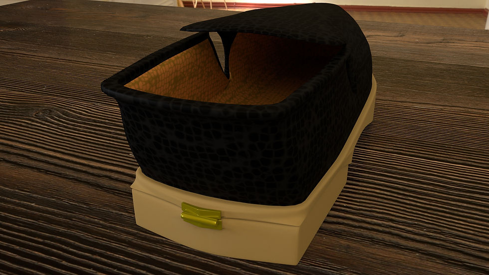
Assignment 1 part 2 - James Bond Gadget
For this assessment, I was tasked with creating a James Bond gadget which is an everyday object used as a tool or a weapon. Like the last assignment, I had the freedom to choose whatever so I decided to go for a shoe that can be used as a phone. The heel would open a keypad, an antenna opens from the front side and holes on the bottom where the speakers normally are.
I didn't take any photos step-by-step since I got too invested in simply finishing the shoe, so what I'll do is post a few zoom-ins and behind the scenes to show how I've made this shoe and what I did to each section of the model.
The shoe on the right is what it looks like without the mandatory smooth tool. Originally, it started as a cube with a few divisions and was then extruded countless times from top, side and bottom to make this shoe shape.
Due to my requirements of the shoe needing to look like ones worn by a suited spy and not like a slipper, Bevels ensue. Lots and lots of Bevels. If you don't know what a Bevel is, it's simply a tool used to place another polygon between an ege or around a face. It's helpful for very sharp corners is used a smaller spread and more divisions.
.png)
Looking closer, the antenna is made up of 3 cylinders with one having an extruded bulb. The little opening has also been extrude and also beveled to hell to keep its squareness. However, it came out round, but still fitted.
.png)
.png)
I would say that this section was the hardest to bevel from my point of view. The stripes from the first image weren't scrapped decor for stripes, but were actually edge loops made to create holes in these squares. They would be the sound output from the phone shoe.
The issue I came accross was the holes not looking deep or sharp enough and looked unnatural. I tried my best to bevel all of the holes, and it did work for the one on the corner. However, it doesn't work on the rest of the holes when doing them one at a time or all together. So I ditched the bevel on this section to avoid inconsistency.
.png)
This is the keypad that has been extruded and also beveled to retain their shape. I originally had the idea to print numbers on each key but I didn't have that kind of knowledge at the time.
Other than bevel issues, my major issue I had was the opening on the back of the shoe. Its purpose was to be a lid for the keypad and so I naturally cut out the end of the shoe and made a few changes with the extrude tool so it has an inside.
However, the lid despite looking fine unsmoothed looked broken when smoothed out. This was something I couldn't fix so I hid the broken piece and made a new one from scratch. I took a cube and used the shoe as reference to bring back the lid.
.png)
.png)
With everything sorted, I placed a pivot on the tip and used it to open and close the shoe whenever I needed to.
.png)
Other things to mention is that the materials used are all SurfaceShaders with prebuilt Maya leather materials added to help make this shoe look like it's made of a legit material. I did my best to make rubber, metal and plastic for other parts on the shoe.
With that said, below are 9 renders. 6 done in daylight, 3 in harsh lighting in the night.


Assignment 2 - Rooftops and Time Warp
For this portion of the assignment, I was tasked with 2 more major projects: One involved creating a rooftop and the other involved a piece of history recreated. Using my knowledge of Substance Painter and other software other than Maya, and the use of the UV tools, I'd use them to finish up my projects to a much higher standard compared to my shoe phone. I'll go through my plans in the following paragraphs.
For the rooftop, I would have to use my own imagination and take a wild guess as to how I want to approach this. I'm thinking of probably using a billboard on top and use Substance Painter to draw an advert or scribbles. Anything extra like pipes, air conditioning, ventilation and fences can help bring the rooftop to life.
As for the Time Warp, I've made up my mind on what I'd like to recreate, and that would be Dead Man's Corner from 1944 France. This location was where an American tank got shot down in a corner and the building next to it has become a museum. My chosen objective is to take that building, recreate it in Maya, and as a side activity, take that broken tank and model it for extra marks.


Assignment 2 part 1 - Rooftop
For the rooftop, I have enountered a few issues that I'd like to document.
One of the issues involved a pipe that when using a curve tool and extruding the face of a cylinder, caused an entirely different part of the cylinder to extrude on the end of the line. I'm unsure how this happened, but alas, I decided to duplicate the model. cut off the extra polygons and then hide the mess under the metal box which I normally use for the pipes.
.png)
.png)
Above shows the results of one of the textures having a fit with a certain component in the material. What I used was the height map for the textures I was importing, but either Arnold or my models did not react very well to the map and ended up stretching my models to ridiculous sizes. From now on, I simply avoid using height for most of my projects to counter this for now.
.png)
Not to sound personal, but this single image has made me weep for a couple minutes. I honestly to heart have no clue how or what I did to glitch out the base building UV. All I knew was that I had to start from scratch and this slowed everything down, to the point where I had cut a few corners and skip out on other things I wanted to do.
Once my UV decided to work, I got to painting all of the textures on Substance Painter Each model had their surface painted to their liking.
My mistakes kept coming as I lost all my UVs to another freakout crash that lost all my progress. Thankfully, I saved them all as object files and importend them to a new scene. Now, I have the rooftop ready for your viewing pleasure.


Assignment 2 part 2 - Dead Man's Corner
Dead man's corner was my choice for Time Warp so I'm here and ready to start recreating the location. Intentionally, I chose to ignore taking most of the inspiration from the current museum due to some parts of it being reworked or replaced, so my 2 sources of reference would have to be older black and white images and a game that gave me the idea in the first place: That being Brothers in Arms. I don't have any means of playing the game so most of the references are quick captures from walkthroughs. Most of them focused on the sides since there haven't been any other older images taking photos of the sides.
.png)
.png)
.png)
References for the sides of the building.
Like the rooftop and everything else, the building was made out of a single block with about 16 to 18 divisions on all sides. I extruded, stretched and bent the square so that I could make the roof and the back portion of the house.
Once I got the shape I wanted, I extruded a lot of faces to create windows and the noticable stripes on the corners of the house, door and pre-mentioned windows. Including all of that, I extruded a balcony-like surface for the door and spawned in a set of stairs.
.png)
.png)
.png)
Once I got the base of the house sorted, I got to work by colouring it with simple colours that reflect the future matarials that I'll be applying. After that, I began taking the side window and duplicating it to the front and other side, and adding some pipes to the outside of the house. That same issue I had in rooftops occured here and it was annoying. I managed to do the same thing and delete the mistake off the pipe.
I then decided to move on with modifying the balcony and so I painted it in a white ceramic texture since the material is quite smooth in the references. I used an extrude tool on a cylinder to recreate the little pillars. Out of all the props, these ones took the smooth tool quite well.
.png)
I've added a lot more props later. A chimney, fence around the house, a ramp and a wooden door to said fence. Also, I've reshaped the plane so that it leaves a road for when I get around to texture it.
This is the part where I have all the props ready for their UVs to be modified. I selected each part of the house's materials and layered out the UV so that they don't recieve any stretched textures. Some of them had taken short cuts like the grey pillars that didn't have their UVs moved around much to be matched. But for the most part, the textures were corrected so that they don't look weird.
Once I had the UVs for the props sorted, I duplicated the chimney, door and fences with the updated UVs so that way, I don't do them one at a time.
.png)
Above are the materials that I used for the project. All of them have been made except for the Grass and Wood textures that were taken from Bridge while the Black Bars and Balcony used a standard flat material. Like the rooftop, I tried my hardest to avoid the same issues; No height map and minimal Normal mapping to avoid those black renders.
As for other things to address, I had this project crash and corrupt on me multiple times, to the point where I was unable to have enough time importing the tank as an extra prop to the scene. With all that being said, the final renders are below this paragraph.


